

Let’s cut to the chase: most generic landing page advice is useless for law firms. The reality is that legal landing pages convert at a dismal 3% to 7% on average. That means for every 100 expensive clicks you buy, 93 to 97 of them are vanishing into thin air.
Why the low numbers? Because for a law firm, a landing page isn't just a digital brochure. It's often the very first point of contact with someone in the middle of a serious, stressful, and deeply personal crisis.
Why Most Legal Landing Pages Don’t Convert
In a profession where trust and credibility are everything, your landing page has to do some heavy lifting. It must instantly convey authority, show genuine empathy for someone's situation, and make it incredibly simple to ask for help. It’s less about "capturing a lead" and more about initiating a relationship at a critical moment. Most pages flop because they completely miss this.
The path to failure is surprisingly predictable. It starts with generic advice and ends with a potential client clicking away, feeling more lost than when they arrived.
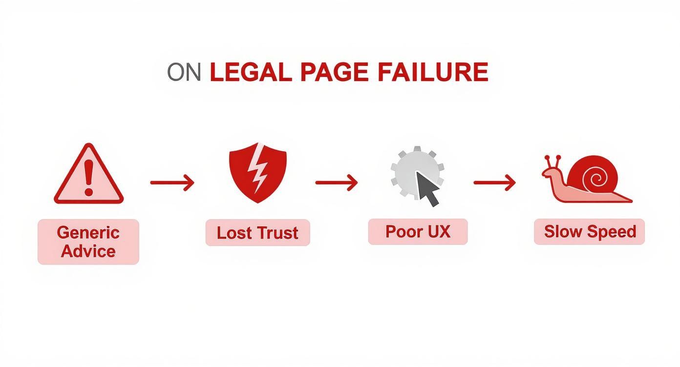
As you can see, a poorly constructed page systematically dismantles the trust a person needs to feel before they’ll even consider sharing the sensitive details of their case.
The Four Pillars of Failure
The journey from a hopeful click to a lost client is almost always paved with the same four mistakes. Once you see them, you can’t unsee them—and you can start building pages that actually get the phone to ring.
-
Message Inconsistency: The ad promised a "truck accident lawyer," but the landing page is a generic "personal injury" page. This creates an immediate disconnect. The visitor feels like they've been baited and switched, and that initial flicker of trust is gone. It signals a lack of attention to detail, which is the last thing someone wants from their attorney.
-
Weak Trust Signals: Hiring a lawyer isn't like buying a pair of shoes. People are vetting you, and they need proof. A page that's missing professional attorney photos, bar association badges, specific case results, or authentic client testimonials feels anonymous and untrustworthy.
-
Poor User Experience (UX): Imagine being in a panic and landing on a page with a confusing layout, hidden contact info, or a clunky form. It’s infuriating. If reaching out for legal help feels like a chore, potential clients will find a competitor who makes it easy.
-
Slow Technical Performance: Every single second your page takes to load, especially on a phone, is another reason for someone to leave. When you’re dealing with an urgent legal matter, patience is a luxury most people don't have.
Your landing page is your firm's digital handshake. If it's flimsy, confusing, or slow, that’s exactly what a potential client will assume your legal services are like. That first impression decides everything.
Industry benchmarks back this up. Conversion rates in the legal field tend to hover between 3% and 7%, with the median sitting closer to 3.3%. Sure, high-intent practice areas like bankruptcy or tax law can sometimes hit over 7%, but the majority struggle. You can discover more insights about landing page optimization and see how small changes drive significant results.
Aligning Your Ad with Your Landing Page
Think of your ad as a promise. When a potential client sees your ad for a "car accident lawyer" and clicks it, you've made an implicit promise to provide exactly that. Your landing page’s most critical job is to keep that promise instantly. This direct connection, often called message match or "ad scent," is the absolute foundation of a high-converting landing page.
Get this wrong, and you're just lighting your ad budget on fire. When someone lands on a page that feels disconnected from the ad they just clicked, confusion sets in, and trust vanishes. They feel like they've been tricked. This isn't just about repeating a keyword; it's about creating a seamless, reassuring path from their desperate Google search right to your contact form.

It’s an emotional handoff. If your ad screams urgency—"Hurt in a Crash? Get Help Now"—your landing page can't greet them with a calm, generic "Welcome to Our Firm." It needs to match that energy with a direct headline, obvious next steps, and easy ways to get in touch immediately.
The High Cost of Being Too General
One of the most common mistakes I see is a mismatch in specificity. A person searches for a "motorcycle accident lawyer," clicks an ad with that exact phrase, and lands on a page that says, "Top Personal Injury Attorneys."
Technically, it's not wrong. But it creates immediate friction. The visitor now has to do the work, scanning the page to confirm you actually handle their specific problem. That moment of hesitation is all it takes for them to hit the back button and find a competitor who gets it right.
A great landing page doesn't start a new conversation; it continues the one your ad began. This single principle is what separates pages that convert at a dismal 3% from those hitting 10% or more.
The only real solution is to build dedicated landing pages for each of your core ad groups. If you're targeting "dog bite lawyer," that ad should lead to a page all about dog bite cases. Same for "wrongful death" or "slip and fall." Crafting highly specific ad copy is the first piece of the puzzle, and you can see how powerful this is in these 8 winning law firm ad copy examples.
Keeping the Scent: A Practical Breakdown
Maintaining this "ad scent" is about more than just the headline. It’s about creating a consistent, trustworthy experience by aligning multiple key elements. When a potential client sees the same language, offers, and tone from the ad to the page, their confidence in your firm skyrockets.
Here’s a quick guide to keeping the scent strong by aligning elements from your ad to your landing page.
Ad Scent Analysis Ad vs Landing Page Elements
| Ad Element | Example Ad Copy | Matching Landing Page Element | Optimization Tip |
|---|---|---|---|
| Headline | "Hurt in a Truck Accident? Get a Free Consultation Now" | H1 Headline: "Truck Accident Lawyers Fighting For Your Maximum Compensation" | The landing page headline should be a direct echo or logical expansion of the ad's headline. |
| Key Selling Points | "No Fee Unless We Win" | Sub-headline/Bullet Points: Prominently feature "Contingency Fee – No Fee Unless We Win" above the fold. | Your unique value propositions from the ad must be instantly visible on the page without scrolling. |
| Call to Action (CTA) | "Schedule a Free Case Review" | Button Text: "[Schedule Your Free Case Review]" | Use the exact same action-oriented language on your CTA button as you did in the ad. Don't switch to a generic "Submit" or "Contact Us." |
| Tone & Urgency | "Don't Wait – Evidence Disappears. Call 24/7." | Page Copy & Banners: Use phrases like "Immediate Help Available" and feature a click-to-call phone number prominently. | Mirror the emotional context. If the ad is urgent, the page must feel urgent. |
This consistency pays off. Research has shown that shorter, highly focused landing pages can perform up to 13.5% better than longer, more generalized ones.
Even better, personalized CTAs—which perfectly match the user's search and ad—have been found to convert 42% more visitors than generic calls to action. In a competitive field like law, that's an edge you can't afford to ignore. It’s all about making the path from click to client as smooth and intuitive as possible.
Earning a Potential Client's Trust in Seconds
Let’s be honest. When someone clicks your legal ad, they’re probably not having a great day. They're often stressed, anxious, and maybe even a little scared. They're not just browsing; they're looking for a lifeline—a credible, trustworthy expert who can help them with a serious, often sensitive, problem.
In this high-stakes context, trust isn't just a nice-to-have feature on your landing page. It's everything.
If you can't build that trust almost instantly, nothing else matters. The most brilliant ad copy or slickest design will fall flat. Your visitor needs to see real, tangible proof that your firm is legitimate, experienced, and the right choice to handle their case. Think of your landing page as the digital equivalent of your office lobby. It needs to project the same professionalism and authority a client would feel walking through your front door.
A potential client’s brain is on high alert, subconsciously scanning for reasons to trust you or reasons to hit the back button. Your first and most important job is to pass that split-second test.
The Absolute Must-Haves for Building Credibility
Some trust signals are so fundamental that if they're missing, it's an immediate red flag. These are the elements potential clients subconsciously expect to see, and they form the bedrock of your page's credibility.
-
Real Attorney Photos and Bios: People hire people, not a faceless logo. High-quality, professional headshots of your attorneys give your practice a human face. Pair them with short, accessible bios that highlight relevant experience and a genuine commitment to helping people. This builds a personal connection and establishes immediate authority.
-
Client Testimonials and Reviews: Nothing is more powerful than social proof. Featuring authentic testimonials from past clients—ideally with their photo—is third-party validation that you deliver on your promises. It shows visitors that other people in their exact situation trusted you and got a positive result.
-
Bar Association and Award Badges: Displaying recognizable badges from state bar associations, Super Lawyers, Martindale-Hubbell, or other legal directories is a powerful visual shortcut to credibility. These act as instant professional endorsements, cementing your firm’s standing in the legal community.
Trust isn't built with a single element. It’s the cumulative effect of all these signals working together. Each badge, photo, and review adds another layer of reassurance, making a visitor feel safe enough to share the sensitive details of their case.
It’s no surprise that top-performing legal landing pages convert at 13.1% or better, which is more than double the industry median of 6.3%. That difference almost always comes down to an expert-level execution of these trust-building fundamentals.
The Subtle Details That Make a Big Difference
Beyond the big, obvious signals, other elements work in the background to create a secure and professional atmosphere. These might be more subconscious, but they have a massive impact on a visitor's confidence by addressing their unspoken anxieties about security, transparency, and results.
For example, a visitor is far more likely to fill out a form if they feel their personal data is safe. A secure connection isn't just a technical detail; it's a baseline expectation.
Here’s how to layer in these other crucial trust boosters:
| Trust Element | Why It's So Important | How to Do It Right |
|---|---|---|
| Clear Contact Information | This makes your firm feel real and accessible. Hiding your phone number or address just looks suspicious. | Put a click-to-call phone number and your physical address in both the header and the footer. Don't make people hunt for it. |
| Case Results (with Disclaimers) | This gives potential clients concrete proof of what you can do. It’s the ultimate way to "show, not tell." | Showcase significant settlements or verdicts, but always include a clear disclaimer stating that past results don't guarantee future outcomes. |
| SSL Certificate (HTTPS) | That little lock icon in the browser signals a secure connection, protecting any sensitive information a user submits. | Make sure your entire site, and especially your landing pages, uses HTTPS. Browsers will flag non-secure pages, which is a huge trust killer. |
| Detailed Privacy Policy | This shows you're transparent about how you handle visitor data, which is especially critical for a law firm. | Add a link to a clear, easy-to-read privacy policy in your landing page's footer. It assures users their information won't be sold or misused. |
At the end of the day, every single element on your landing page is either building trust or eroding it. By thoughtfully layering these signals—from professional headshots and client stories to security seals and transparent case results—you create an environment of undeniable credibility. This is how you calm an anxious visitor's fears, position your firm as the obvious choice, and give them the confidence they need to finally reach out for help.
Designing a Legal Page That Converts
A great legal landing page isn't just a digital brochure; it’s an active guide. Its one job is to take a person from a state of uncertainty and anxiety to a feeling of confidence that your firm is the right choice. After you’ve aligned your ad message and established some initial trust, the page's design is what carries them over the finish line.
Every single element has a purpose. The layout should create a clear visual hierarchy, using design cues like size, color, and placement to direct the visitor’s eyes exactly where you want them to go. Your most critical information—your value proposition and main call-to-action—absolutely must live "above the fold." A visitor should never have to scroll to figure out who you are, what specific problem you solve, and what they should do next.
Optimizing Your Intake Form
The intake form is the moment of truth. This is where a visitor becomes a lead, and every detail matters. The single biggest mistake I see firms make is asking for way too much information upfront. The goal here isn't to complete a full client profile; it's simply to open the door for a conversation.
Keep your form fields to the bare essentials. For that initial point of contact, you really only need three things:
- Name: To know who you're talking to.
- Phone Number: For a direct, timely follow-up.
- Email Address: As a reliable backup contact method.
Asking for anything more—like a detailed case description or a home address—just creates friction and drives down your submission rates. You can gather all that extra information during the initial consultation.
The text on your form's button also has a surprising amount of psychological weight. A generic word like "Submit" is completely passive and offers no value. In contrast, action-oriented, benefit-driven text tells the user exactly what they're getting.
For example, "Get My Free Case Evaluation" is infinitely better than "Submit." It frames the action as a direct benefit, reinforcing the value they're receiving. Making this one small change is one of the most effective call-to-action (CTA) strategies for legal websites.
Creating Immediate Connection Points
While a streamlined form is crucial, you also have to account for people who are ready to talk right now. Legal problems are often urgent. Someone searching on their phone moments after a car accident isn't in the mood to fill out a form.
A click-to-call phone number is non-negotiable, especially for mobile visitors. Make it prominent in the header, the footer, and right next to your main CTA. On a phone, it absolutely must be a tappable link that opens the dialer. The whole point is to remove every possible barrier. In fact, many legal campaigns see higher conversion rates on mobile—some studies show rates as high as 21% on mobile versus 15.9% on desktop—precisely because of this urgent, on-the-go search behavior.
A live chat widget is another fantastic tool. It engages visitors who have questions but aren't quite ready to pick up the phone. It's a low-pressure way to get instant answers, overcome objections, and build the confidence they need to take the next step. By offering multiple, easy contact options—form, phone, and chat—you let potential clients connect on their own terms, ensuring no valuable lead slips through the cracks.
Mastering Technical and Mobile Performance
You can have the most persuasive message and airtight trust signals in the world, but they're all for nothing if your landing page takes forever to load or looks like a jumbled mess on a smartphone. For a potential client in the middle of a crisis, technical performance isn't just a nice-to-have; it's the first test of your firm's competence. They're on their phone, in a panic, and they will absolutely not wait for a slow page.
Every single second bleeds money. Research shows that slow-loading landing pages can tank your conversions by 7%—a devastating loss when you're paying premium prices for every click. A clunky page doesn't just lose a lead; it communicates that your firm might be just as disorganized. You can read the full research about these landing page statistics to get a better sense of the financial drain.

Page Speed Is a Conversion Driver
Let's be blunt: speed kills… your conversion rate. To make sure your landing pages for legal ads load practically instantly, you have to tackle the common technical culprits head-on. This isn't just about user experience; it's a direct line to your ROI.
Here's what to focus on for lightning-fast load times:
- Compress Your Images: Giant, high-resolution image files are the number one cause of page bloat. Use a tool to compress them before uploading. You can drastically cut down file size without any noticeable loss in quality.
- Leverage Browser Caching: This is like telling a visitor's web browser to keep a local copy of your logo, images, and other assets. The next time they visit, the page snaps into view because their browser already has most of the files.
- Minimize Your Code: Messy, bloated code (CSS and JavaScript) forces the browser to work harder. Ask your developer to "minify" the code, which strips out all the unnecessary characters and spaces, making the files smaller and faster to process.
Making these tweaks ensures a potential client gets the information they desperately need without a frustrating delay. A fast page feels professional and reassures them that you’re ready to act.
Your landing page speed is a direct reflection of your firm’s perceived competence. A page that loads in under two seconds says, "We are prepared and efficient." A page that takes five seconds or more says, "We might not have our act together."
Adopt a Mobile-First Mindset
The numbers don't lie. The overwhelming majority of your ad clicks will come from people on their phones. In fact, a staggering 86% of the top-performing landing pages are built specifically to be mobile-friendly. For law firms, this is even more critical—people don’t run to a desktop when they’ve been in a car accident; they search on their phone, right there on the side of the road.
This means you have to go beyond just a "responsive" design that awkwardly squishes your desktop site onto a small screen. A true mobile-first approach means designing the experience for the phone first, then adapting it for larger screens. This is a non-negotiable part of landing page optimization for legal ads.
Pay close attention to these mobile essentials:
- Big, Tappable Buttons: Fingers are clumsy compared to a mouse pointer. Your calls-to-action need to be large, clear, and have enough empty space around them to avoid frustrating "fat finger" errors.
- Click-to-Call Phone Numbers: This is mandatory. A potential client must be able to tap your phone number and have their phone dial it immediately. Don't make them copy and paste.
- Simple, Vertical Layout: Forget complex columns and grids. A single, easy-to-scroll column ensures users can quickly scan your message without needing to pinch, zoom, or swipe sideways.
Truly understanding the importance of mobile optimization for law firms is how you turn high-intent ad clicks into actual clients. A fast, frictionless mobile experience isn’t a bonus feature; it's the only way to win those critical, time-sensitive leads.
Don't Guess—Track and Test for Better Results
Getting your legal landing page live is just the first step. The real work begins now. Without a solid plan for tracking and testing, you’re essentially just guessing what works, and that's a surefire way to burn through your ad budget. Think of it as building a continuous feedback loop, where real user data—not assumptions—guides every change you make.
First things first, you need to get your conversion tracking set up correctly. This is non-negotiable. You have to tell platforms like Google Ads and Google Analytics precisely what counts as a win. It’s more than just tracking a form submission; you need to capture every valuable interaction a potential client has with your page.
Make sure you're tracking these key actions:
- Form Submissions: This is the most obvious one. You need to know every time someone successfully sends you their information.
- Click-to-Call: Especially on mobile, this is a huge one. Tracking when a user taps your phone number gives you insight into those urgent leads who prefer to pick up the phone.
- Live Chat Engagements: If you have a chat widget, track how many visitors actually start a conversation. This is another critical channel for lead generation.
A Simple Framework for A/B Testing
Once your tracking is dialed in, you can start improving what's already working. This is where A/B testing (or split testing) comes into play. It’s pretty straightforward: you create two versions of your page—an 'A' version and a 'B' version—and show them to different groups of visitors to see which one performs better.
The goal here isn't just about finding a "winner." It's about learning what makes your potential clients tick. What headline makes them feel understood? What offer convinces them to take action? What layout removes friction when they're ready to reach out?
My advice? Start by testing the big stuff—the elements that have the most immediate impact on a visitor's first impression. For legal landing pages, this usually means what they see "above the fold."
Here are a few high-impact elements to test right away:
- The Main Headline: Try pitting a benefit-focused headline ("Get the Compensation You Deserve") against a more direct, reassuring one ("Experienced Car Accident Lawyers Ready to Help").
- The Call-to-Action (CTA) Button: Test different copy. "Get My Free Case Evaluation" might feel different to a potential client than "Schedule a Confidential Consultation." You'd be surprised how much these small wording changes can affect conversion rates.
- The Hero Image: Does a professional photo of your legal team build more trust than a conceptual image representing the client's problem (like a car wreck)? Test it and find out.
- Form Length: Is your standard three-field form (Name, Email, Phone) the sweet spot? Or could you add a field for a brief case description without scaring people away?
By testing one element at a time and letting the data guide you, you can stop guessing and start making informed decisions. This methodical approach is how you consistently improve your landing page's performance and make every single ad dollar work harder for your firm.
Frequently Asked Questions
When you get deep into optimizing landing pages for legal ads, the same questions tend to pop up again and again. Let's tackle some of the most common ones I hear from law firms trying to get better results from their campaigns.
How Many Landing Pages Do I Really Need?
The simple rule of thumb is this: create one dedicated landing page for every single ad group.
Think about it from the user's perspective. If you're running separate ads for "car accident lawyer," "truck accident lawyer," and "motorcycle accident lawyer," each one of those clicks represents a person with a very specific problem. Sending them all to a generic personal injury page is a recipe for a high bounce rate.
A user who clicked an ad about their motorcycle crash needs to land on a page that immediately confirms they're in the right place. They want to see images of motorcycles and read headlines that speak directly to their unique situation, not have to dig through a general site to find what they need.
Can I Use Client Testimonials with Names and Photos?
Not only can you, but you absolutely should. Real client stories are one of the most powerful tools you have for building instant trust. Just make sure you do it the right way.
Vague, anonymous quotes like "Great firm! – J.D." just don't have the same punch. They feel generic and could have been written by anyone.
To get the most out of your testimonials, follow these steps:
- Get written permission. Always get explicit consent from the client to use their full name, their photo, and the details of their story in your marketing.
- Check your state bar rules. Advertising regulations vary, so make sure your use of testimonials is fully compliant with your local bar's guidelines.
- Add a face to the name. Pairing a powerful quote with a real photo of the client makes the testimonial instantly more authentic and relatable.
My Conversion Rates Are Still Low. What Should I Check First?
If you’ve made changes but the needle isn't moving, it's time to go back to basics. More often than not, the problem lies in one of three areas.
Start by checking your message match. Is the headline on your landing page a near-perfect mirror of the promise you made in your ad? This is the number one reason visitors bounce. Any disconnect, no matter how small, can create confusion and erode trust.
Next up: page speed, especially on mobile. A slow page is a conversion killer, plain and simple. A potential client dealing with the stress of an accident isn't going to wait more than a few seconds for your site to load—they'll just hit the back button and call your competitor.
Finally, take a hard look at your call-to-action (CTA). Is it crystal clear, compelling, and impossible to miss? A weak, passive CTA like "Submit" will always lose to a stronger, benefit-focused one like "Get My Free Case Evaluation."
At RankWebs, we focus on providing actionable insights and battle-tested frameworks that help law firms turn more of their ad spend into actual clients. Our strategies are built from the ground up for the specific challenges and opportunities within the legal industry. Explore how we can help your firm grow.